
Making a new payment option feel safe enough to try
User research for a bank-backed digital wallet, Paze, for an enterprise financial client.
Paze is a digital wallet that lets customers check out online without typing or sharing their card number. Many banks offer it, and my enterprise financial client was investing heavily to grow it. The product landing page was the main destination for the client’s customer campaigns.
My Role
I led this research study from planning through synthesis. I wrote the research plan, the participant screener and the discussion guide. I moderated the sessions with another UX strategist supporting me. I led the synthesis and the direction of the findings presentation to the client.
The short version: the page told people Paze was secure without showing how, and several of the answers people needed appeared too late. Customers understood the purpose quickly, but switching from a habit like Apple Pay had no clear payoff.
Project Details
- Client: Enterprise financial institution (name withheld)
- Timeline: September to November 2026
- Role: UX research lead
- Methods: 10 moderated sessions, first-impression testing, think-aloud, competitor review, content testing
- Deliverables: Research plan, screener, discussion guide, findings deck, annotated mockup
- Collaborators: Another UX strategist and the client’s product marketing team
The Process at a Glance
1. Scope
Met with product marketing and framed four questions the study needed to answer.
Output: four research questions
2. Plan
Chose a moderate 10-person study and wrote the research plan, screener, and discussion guide.
Output: research plan, screener, and discussion guide
3. Recruit
Recruited active customers who shop online, split by device and payment habit.
Output: 10 participants
4. Test
Ran 90-minute moderated sessions with think-aloud, a competitor review, and a content test.
Output: 10 completed sessions
5. Synthesize
Led the synthesis and turned the findings into eight recommendations.
Output: findings deck and annotated mockup
6. Present and Measure
Presented to the client in November 2026 and set up a pre/post comparison.
Output: prioritized recommendations
The Challenge
The client’s own research showed the real obstacle was not awareness alone. 81% of consumers in their qualitative study had never heard of Paze, and many who had heard of it thought it was redundant with Apple Pay or PayPal. The page had to give people a reason to change a habit they already had.
The client engaged our agency for SEO and conversion work, and I worked with the product marketing team behind the emerging payments products. Marketing wanted to know what was holding people back once they reached the page. The question was how to turn traffic into activated wallets.
What we needed to learn
- Value proposition: Does the page clearly explain why Paze is better than how people pay today, and does it motivate them to switch?
- Message resonance: Which framing of the benefits moves someone from understanding Paze to wanting to activate it?
- Content hierarchy: Do the reassurances people need (who’s eligible, where it works, how their data is handled) appear before they lose interest?
- Conversion drivers: Can people tell what to do next, and does that step feel trustworthy?
My Approach
Step 1: Right-size the study
We chose a moderate study of 10 participants because of budget constraints, timing, and the lack of reliable on-page metrics. This approach set our service apart from what the marketing and SEO teams were already doing.
Step 2: Recruit for contrast
I recruited active customers who shop online regularly and excluded marketing and finance professionals to reduce bias.
The group was balanced across:
- Device: mobile and desktop users
- Payment habits: people who type their card numbers manually and people who rely on wallets or autofill
- Age: a broad range of adults
Step 3: Run five-part sessions
Each session lasted 90 minutes and moved from what people already believed to how they reacted to the page and its competitors. The first three parts focused on the page:
- Warm-up interview on shopping habits, checkout trust signals, and what Paze meant to them before seeing anything
- 20-second first-impression scan of the landing page, to see what people noticed and whether the purpose was clear
- Think-aloud scenario: people saw Paze for the first time at a checkout, explored the page aloud, tried a task (finding return information), and said what they expected the activation button to do
The last two parts looked beyond the page:
- Rapid review of three competing bank pages, 60 seconds each, followed by a few structured questions
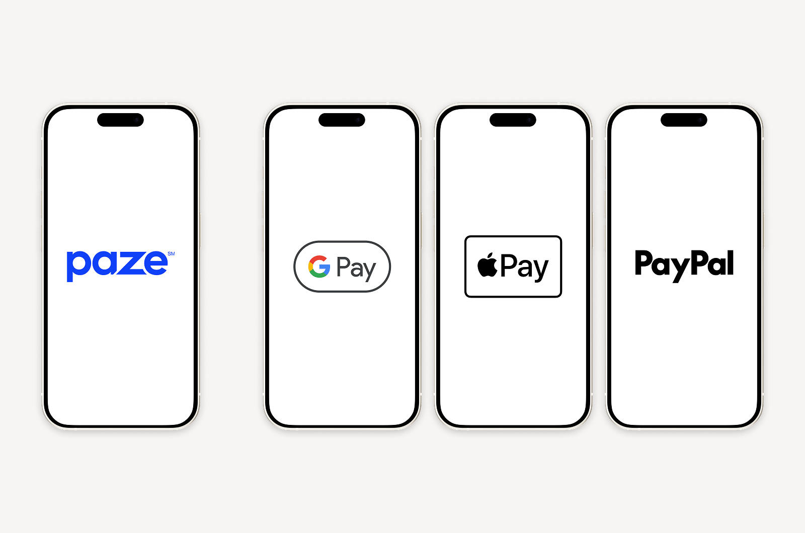
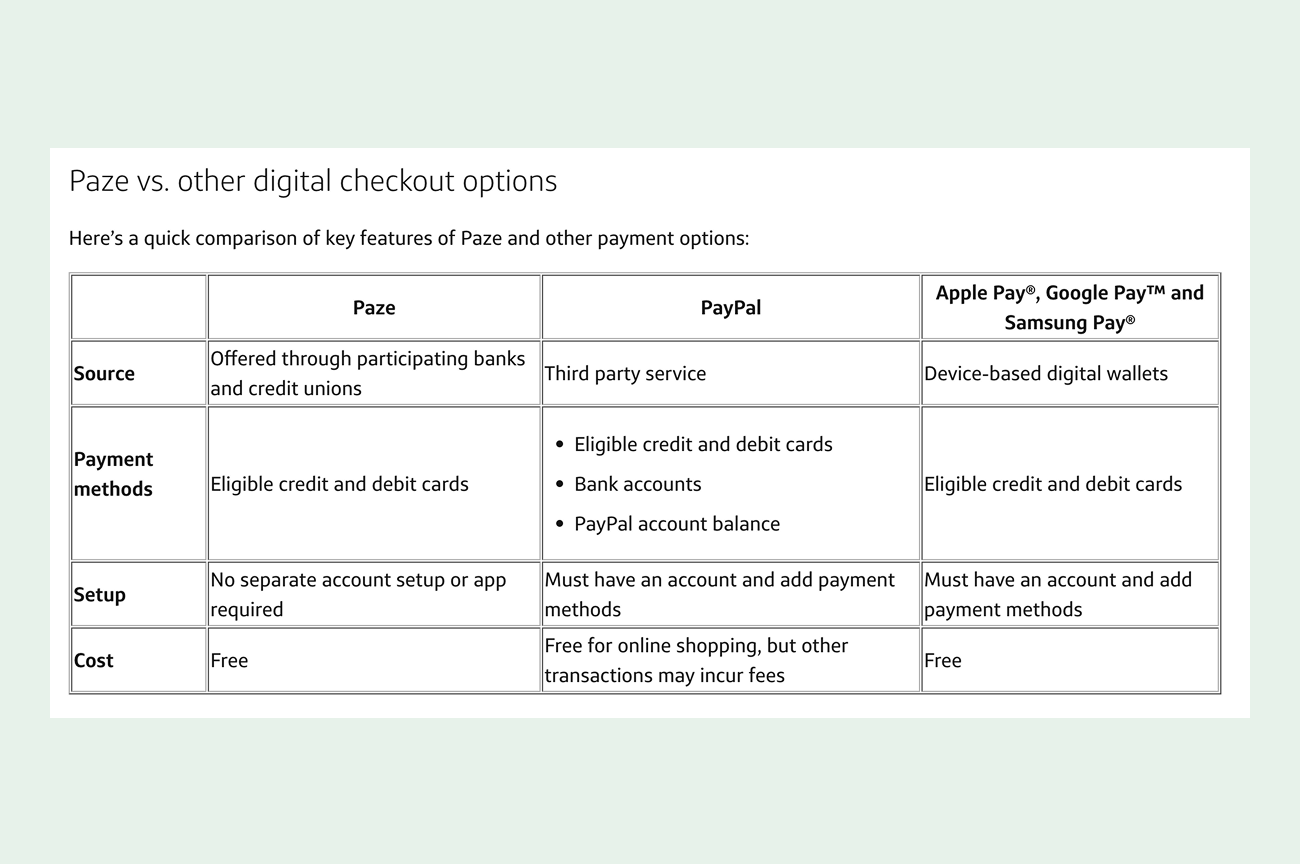
- Comparison content test: I shared the client’s “Paze vs. other payment tools” article, because its content could help generate ideas for the client’s question, “how can we position Paze against other digital payment tools?”
Step 4: Plan for a pre/post comparison
The client planned to review the recommendations internally, so I set up the findings for a pre/post comparison once changes ship.
Because the sample was moderate, I treated the findings as directional and flagged what would need a second round of testing.
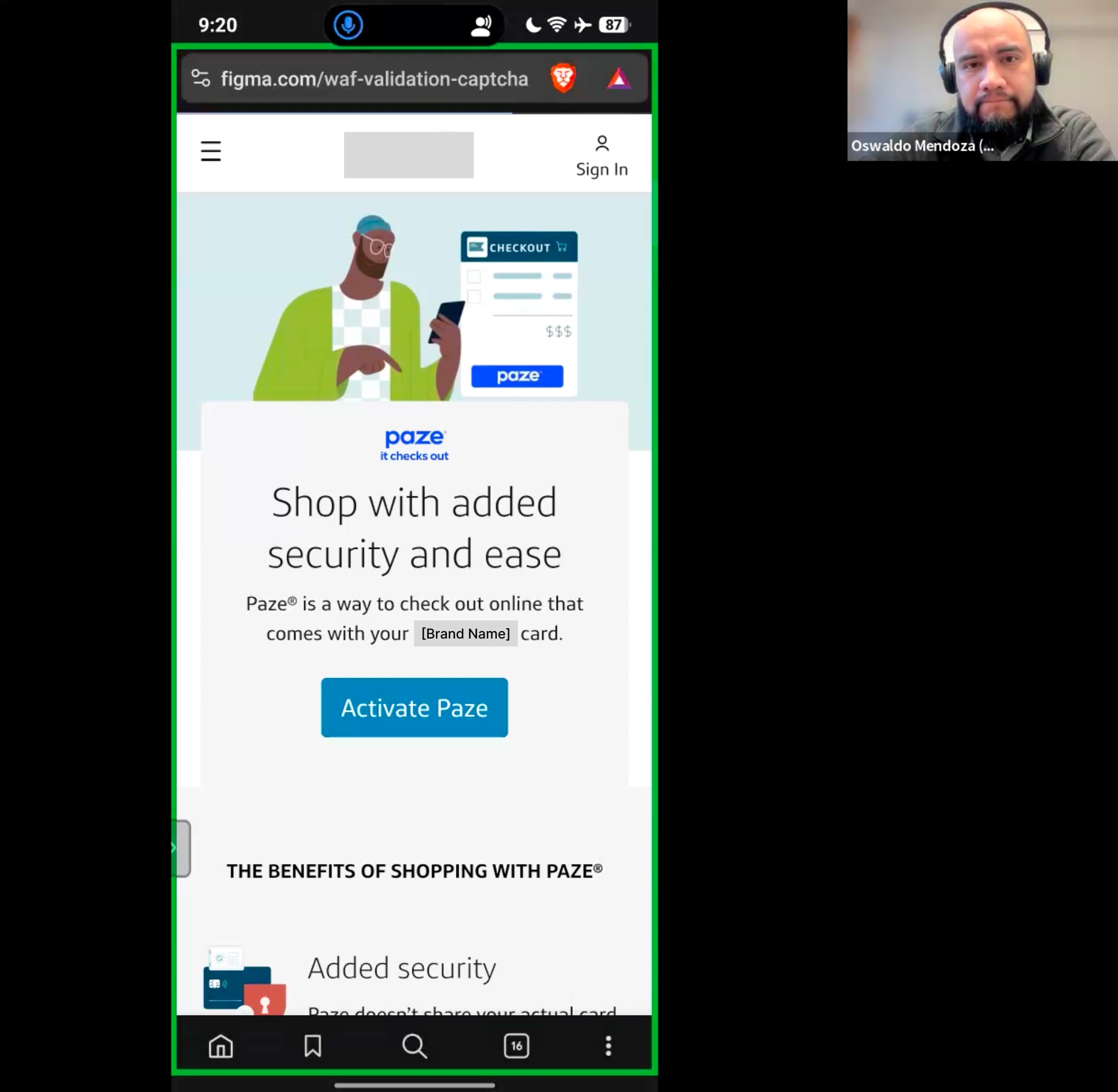
Example of a prompt from the research discussion guide to help contextualize pain point when reviewing the landing page
“You mentioned you usually pay with [their stated method]. Let’s say you’re checking out online, and right at that point you notice an option called Paze. [share the friction story in warm-up: “Kind of like what you described earlier with [their friction moment], you’re not fully sure about it yet.”] You haven’t decided whether it’s worth using instead of what you’d normally do. Go ahead and pull up this [Brand Name] page and look through it the way you naturally would, saying whatever you’re thinking as you go, even small stuff, questions, reactions, whatever comes to mind.”
Research Findings
Core insight: Customers understood what Paze was for. What held them back was that security was claimed but not explained, and the reasons to switch appeared too late.
Landing page strengths
- People understood the purpose within 20 seconds.
- The client’s brand worked as a trust signal.
- Setup looked easy.
- “Your card number isn’t shared with merchants” was the benefit that stuck.
Participant, on the page’s strengths
“The main benefit to me is that it doesn’t give your card number to all these different retailers. So you have that level of security with Paze.”
Friction points
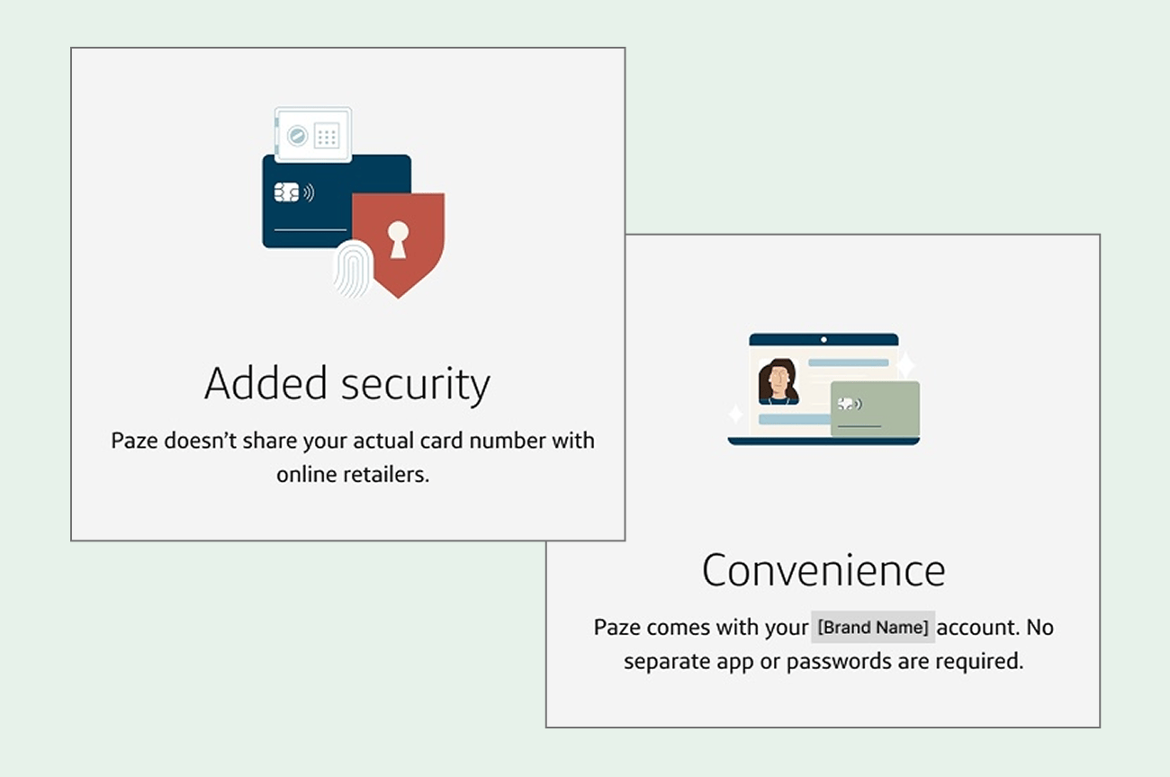
The page said Paze was secure but never explained how. One participant concluded it was “just using my card to check out.” Three questions also surfaced too late: who could use Paze, where it worked, and why anyone should switch. Some read the hero as meaning Paze belonged to one bank until the FAQ showed a multi-bank network, and “select online merchants” sounded like a limit. Participants saw no benefit over Apple Pay and wouldn’t change, and finding cards already linked without an opt-in made some wonder what else could be enrolled without asking.
Participant, on friction point & gaps
“There is already Apple Pay and PayPal and why do we need to add another payment option apart from those, then I will probably not do it.”
What competitors taught us
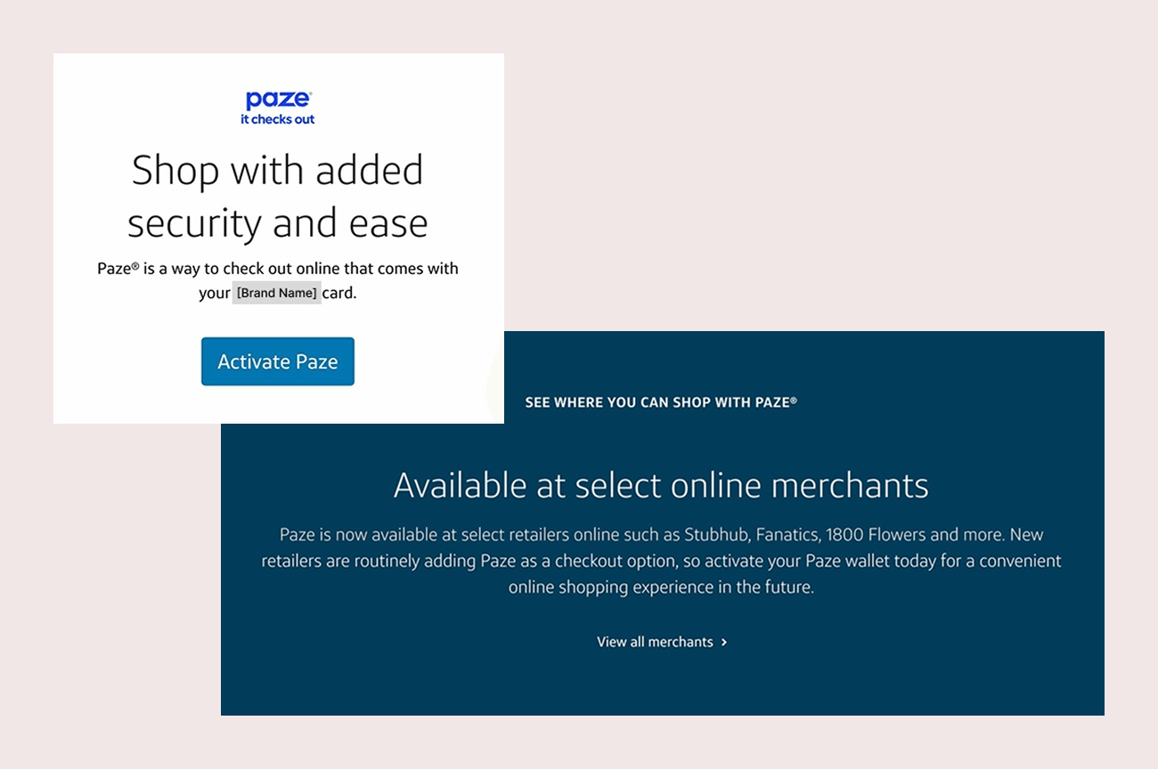
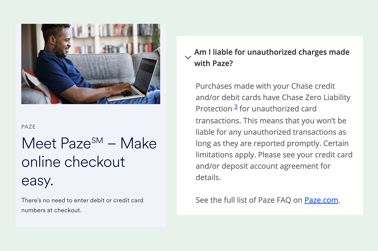
Each competitor page did one thing well. One said “no need to enter card numbers” right at the top and made clear who owns Paze and that it works across banks. Another explained how the security works and who is responsible for unauthorized charges, which turned “secure” from a claim into something people understood. It also showed screenshots of the real checkout, so people could see Paze isn’t only for phones. A third showed familiar store logos early, so people could see where Paze works at a glance.
Participant, on competitor pages
“And this one’s a little bit more explanation. Paze replaces your sensitive card data with a token. So that tells you they’re not getting your actual charge card. They don’t have total access to your charge card or expiration date and CVV code.”
Product comparison article
The side-by-side comparison article also helped. It gave Apple Pay and PayPal users a concrete reason to consider adding Paze, and “no account required” lowered the perceived barrier. It showed a trust gap too: multi-bank backing raised privacy questions that the copy should address directly.
Participant, on competitor pages
“I think for me, the biggest thing was that it’s not a third party app or function. I hadn’t thought before about how PayPal and Zelle and Venmo do all require apps. It’s a separate entity. So I think that was a big difference.”
What I Recommended
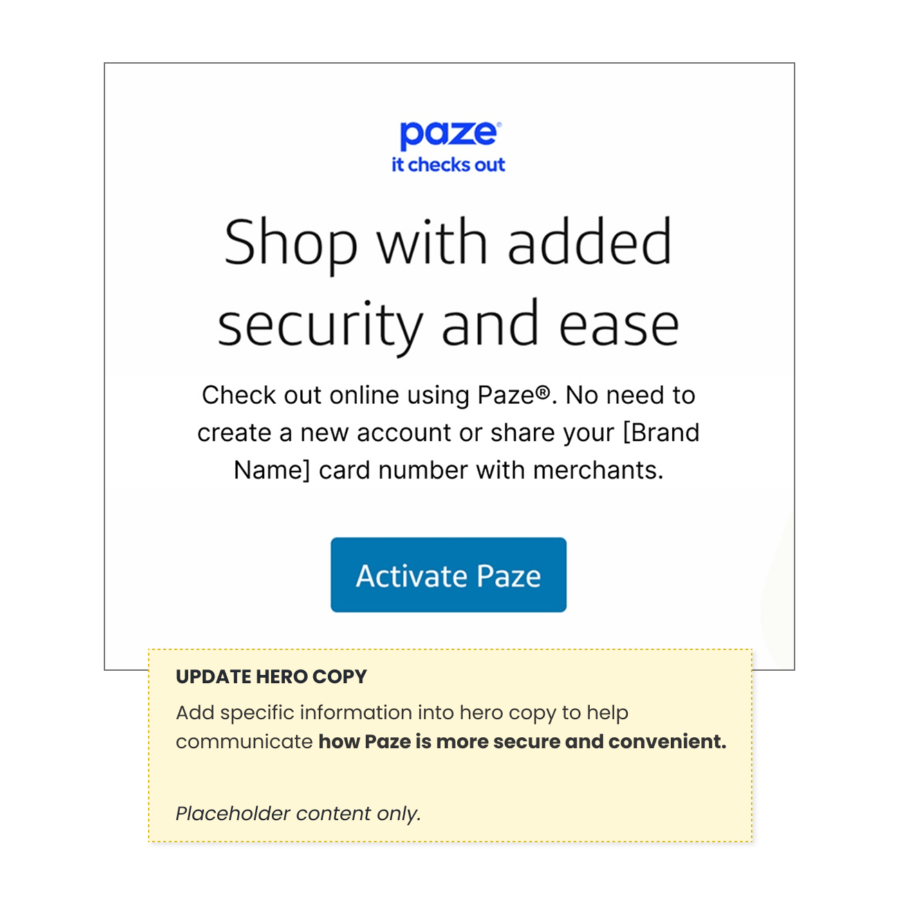
I turned the findings into eight recommendations, shown on an annotated mockup and sorted by impact and effort so the client could decide what was feasible given legal and resource constraints:
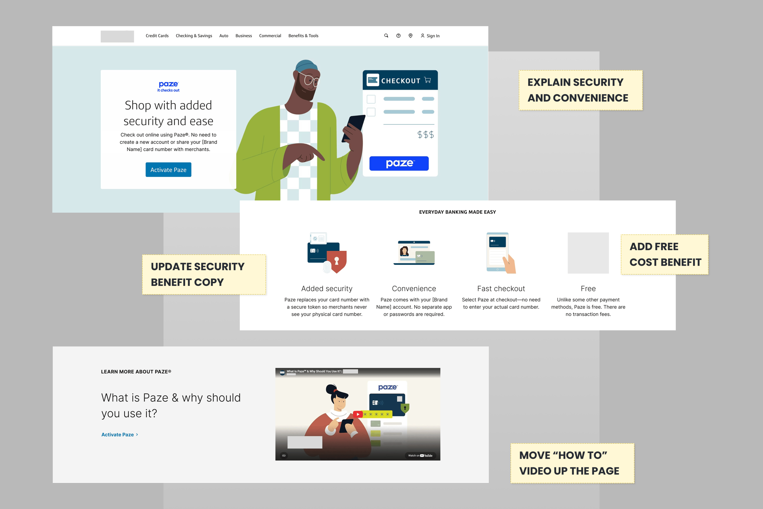
- Update the hero copy to say specifically how Paze is more secure and convenient.
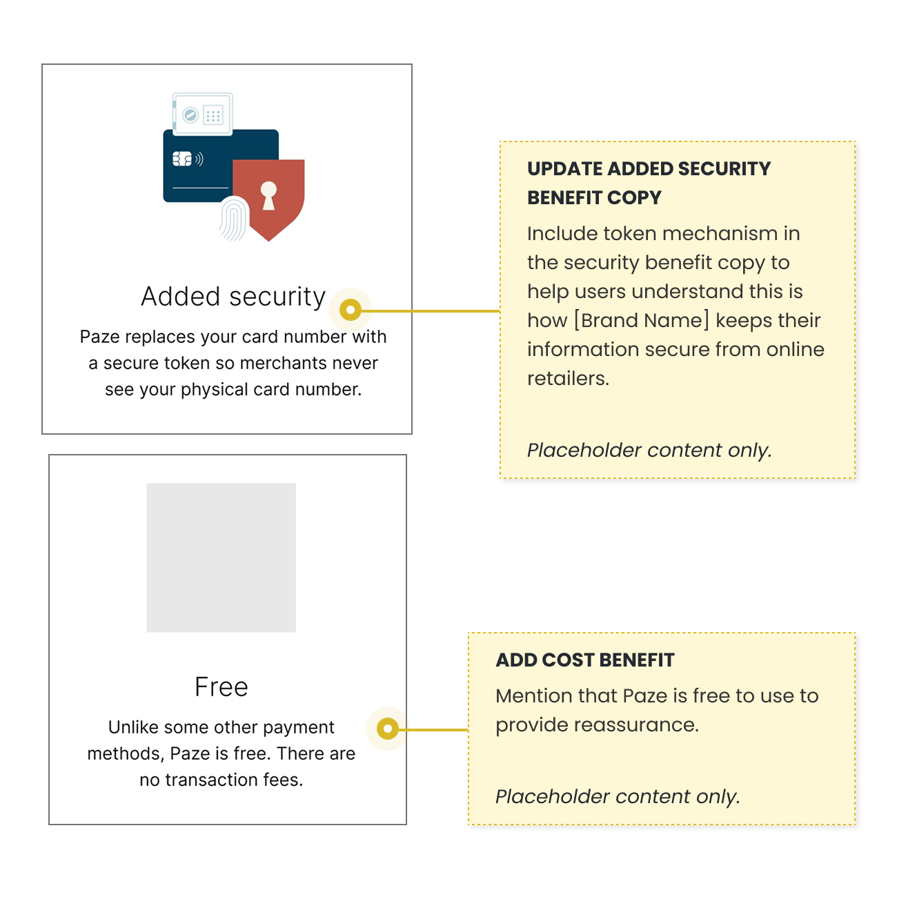
- Add the token mechanism to the security benefit.
- Add a “free to use” benefit.
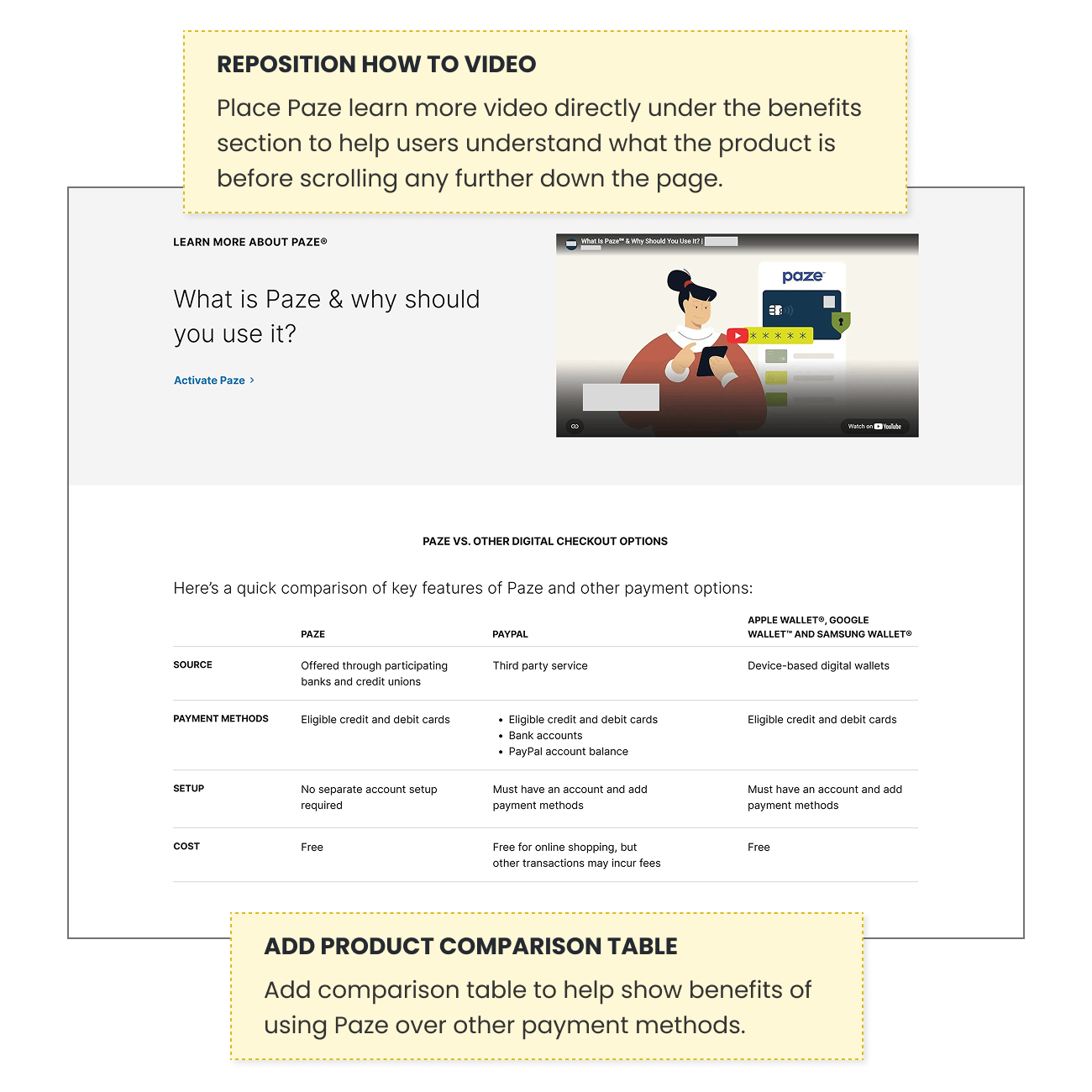
- Add a comparison table showing Paze against familiar payment tools.
- Move the “learn more” video directly under the benefits section, so people understand the product before they keep scrolling.
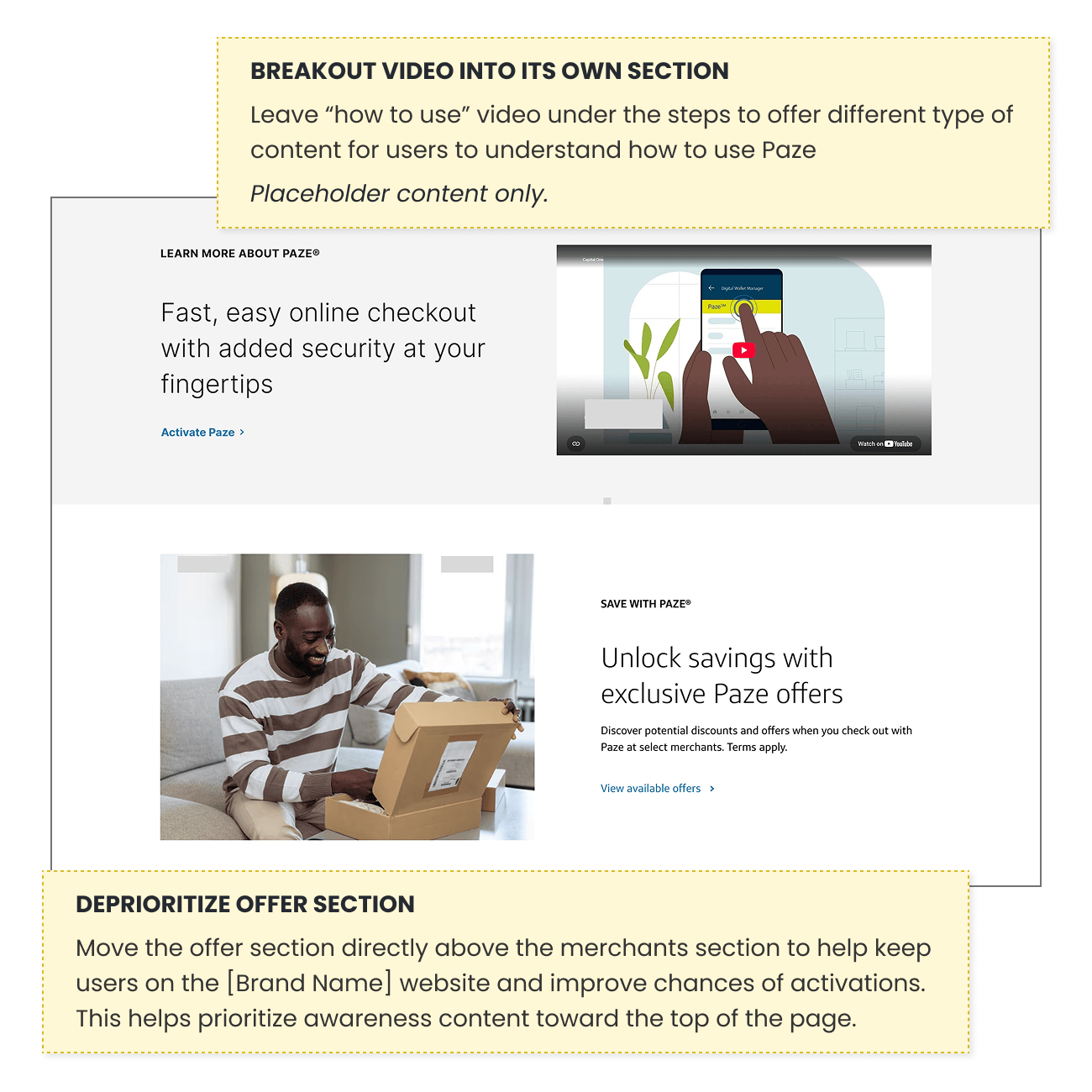
- Move the offers section lower, so people stay on the page and reach the activation steps before leaving for a merchant.
- Add an FAQ that explains the security technology in plain language. The SEO team also flagged AI-search questions about Paze security where the client isn’t yet cited, which this FAQ can answer.
- Keep the “how to use” video under the steps, as a different kind of content for learning how Paze works.
The client’s broader research suggests people want reassurance more than technical education, so the security explanation should stay short and in plain language.
Outcome
I presented the findings to the client in November 2026. The client is deciding which recommendations to move forward. The deck also proposed applying the learnings to Paze messaging and new articles.
What happens next
Nothing has shipped yet, so I can’t report results. The recommendations are untested until the client implements them.
- The client decides which recommendations to implement
- Updates ship to the landing page
- A pre/post analysis runs against the Q3 2026 baseline, when the page launched
For context, the landing page received about 5,600 organic visits in July 2026, up 26% from June, which gives the client a starting point for the comparison.
What I Would Measure
If I were driving the strategy, I would track:
- Landing page CTA click-through rate. The analytics data still shows discrepancies, so I would measure against the Q3 2026 baseline and run a three-month pre/post analysis once updates are implemented.
- Activation rate from landing page visits, since activated customers are far more likely to transact (11.5x in the client’s data).
- Engagement and visibility. Scroll depth with the comparison table, security FAQ and videos; bounce rate and time on page; organic visibility, including AI-search citations; and a second round of testing on the revised page.
What I Took From It
- Trust has to be explained, not announced. A bank’s name earns the first look. People still need to see how a product works before they’ll change a habit.
- Order matters as much as copy. Several of the biggest problems were the right answers appearing too late on the page.
- Competitor pages are research material. Testing them side by side showed what the client’s page lacked without anyone having to guess.
- Limits: This was a qualitative study with 10 participants, and most applicants described themselves as very comfortable with digital payments, so reluctant users were underrepresented. The recommendations are untested until the client implements them.