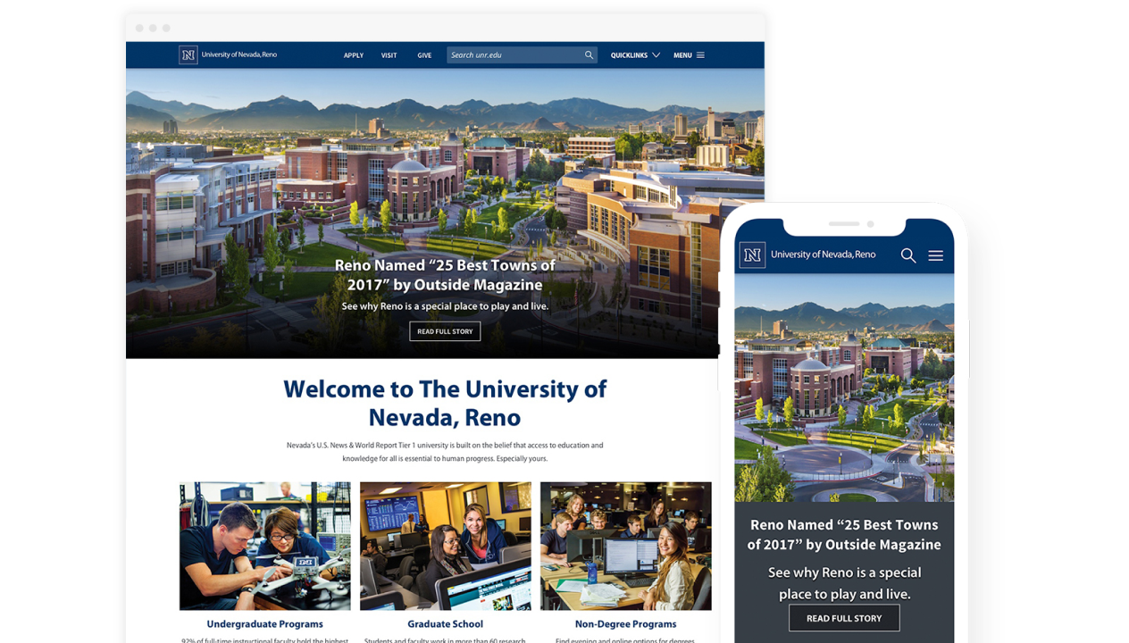
University of Nevada, Reno Website Redesign
- Client: University of Nevada, Reno
- Timeline: 2017-2020
- Role: Lead Designer
- Methods: User Interviews, User Testing, Web Accessibility
- Collaborators: SEO, Content, and Web Dev Teams, UX Designer
Overview
In 2017, the university was facing a federal ADA complaint (OCR) tied to inaccessible content across more than 15,000 pages, and department marketing specialists had no way to update their own pages without funneling every change through a small central web team. The redesign had to solve both at once: bring the site into compliance and give departments a self-service path that wouldn’t recreate the accessibility problem all over again.
Role
As lead designer, I researched, designed, and tested all new UI patterns for accessibility under an OCR-monitored Corrective Action Plan, and built the case with data, not just design opinion, for the structural and navigation decisions that followed. I worked with the marketing web team, the campus accessibility manager, and department specialists.
Results
- Remediated 11 of 13 (85%) major accessibility issues flagged in the external audit tied to the OCR Resolution Agreement (7 core use cases across 40 pages), ahead of the corrective action plan’s reporting schedule.
- Raised the sitewide Siteimprove accessibility score from 75% to 95% (WCAG 2.0 AA), our main KPI for the project.
- Launched Phase 1 on schedule (Feb 20, 2019): the six highest-traffic sections plus two colleges, with the remaining 250+ sections migrating in later phases.
- Built a repeatable audit process (Siteimprove scans, manual keyboard-navigation and VoiceOver testing) that outlasted the launch.
- Moved content ownership to departments through a modular component system, so accessible patterns were enforced by the components rather than by each editor.
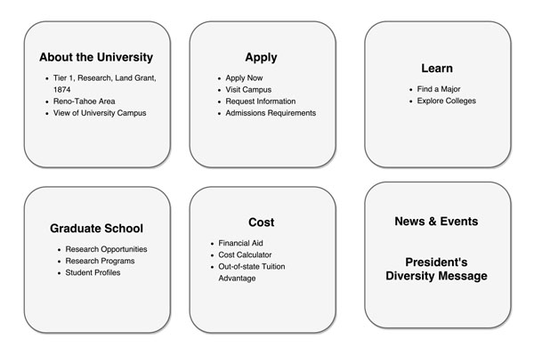
- Settled navigation with evidence: top-task and analytics data decided which links earned primary placement.
Accessibility
Working through front-end implementation with the campus accessibility manager deepened my practice. Before launch, we ran the same 7 use cases the original auditors used with a screen-reader user, which closed the loop between what was flagged on paper and what someone using assistive technology actually experiences. It also gave me a concrete way to walk stakeholders through that experience instead of describing it.
Discovery and research
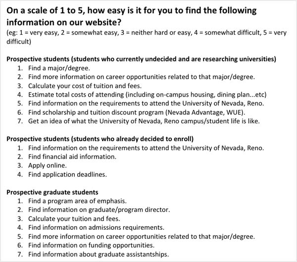
We needed to understand how users found the university, what mattered most to them, how easily they could find it, and what devices they used to get there. Research methods included:
- Competitive research on how peer universities structured their content and navigation
- In-person interviews with prospective students, parents, and faculty
- Top-task analysis to identify what users actually came to the site to do
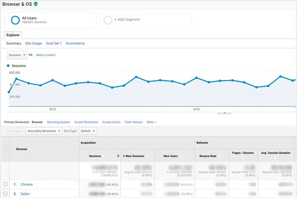
- Analytics review to understand on-campus vs. off-campus device usage
Personas and information architecture
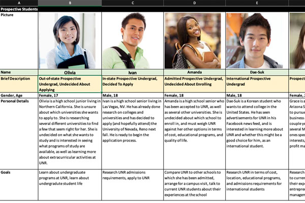
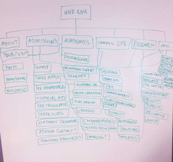
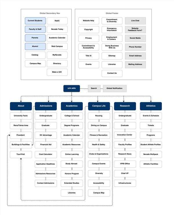
From the research, I built personas and identified the highest-priority information our users were searching for, then worked with the team on a new site architecture. This is where the optimization mindset started to show up concretely: when nearly every department wanted a spot in primary navigation, we used analytics to justify which links actually earned that placement.
Wireframes
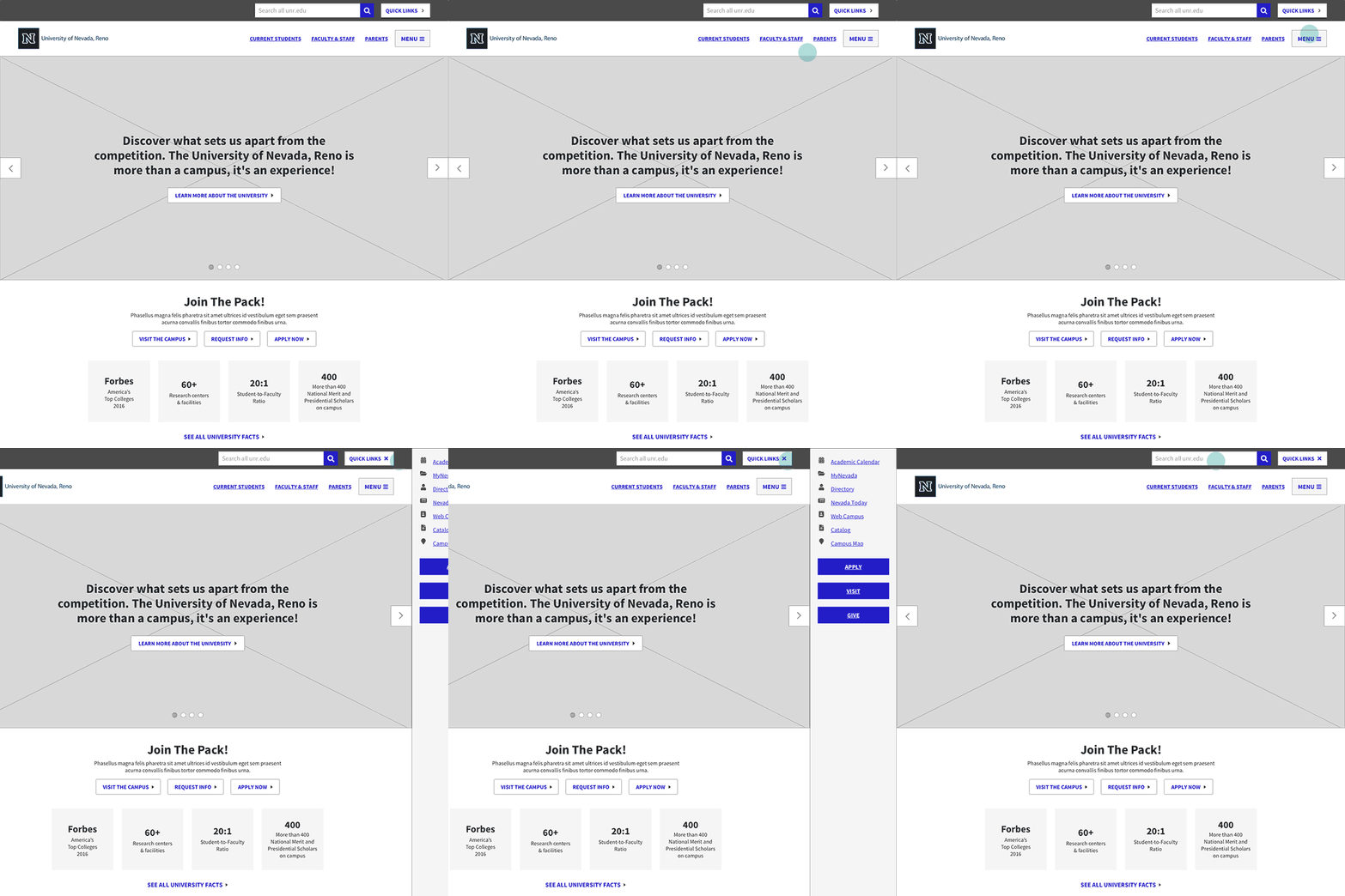
With research and IA in place, I designed wireframes around a modular, component-based approach built to work within the CMS — so department specialists could assemble their own pages without needing a developer for every change.
Low-fidelity prototypes
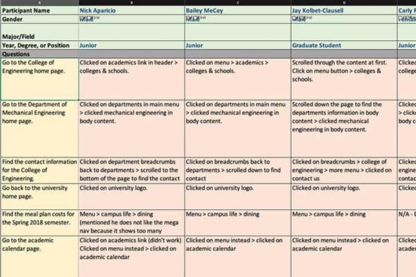
We tested low-fi prototypes with students and faculty, focused on one core question: could users actually find what they came for.
Visual design
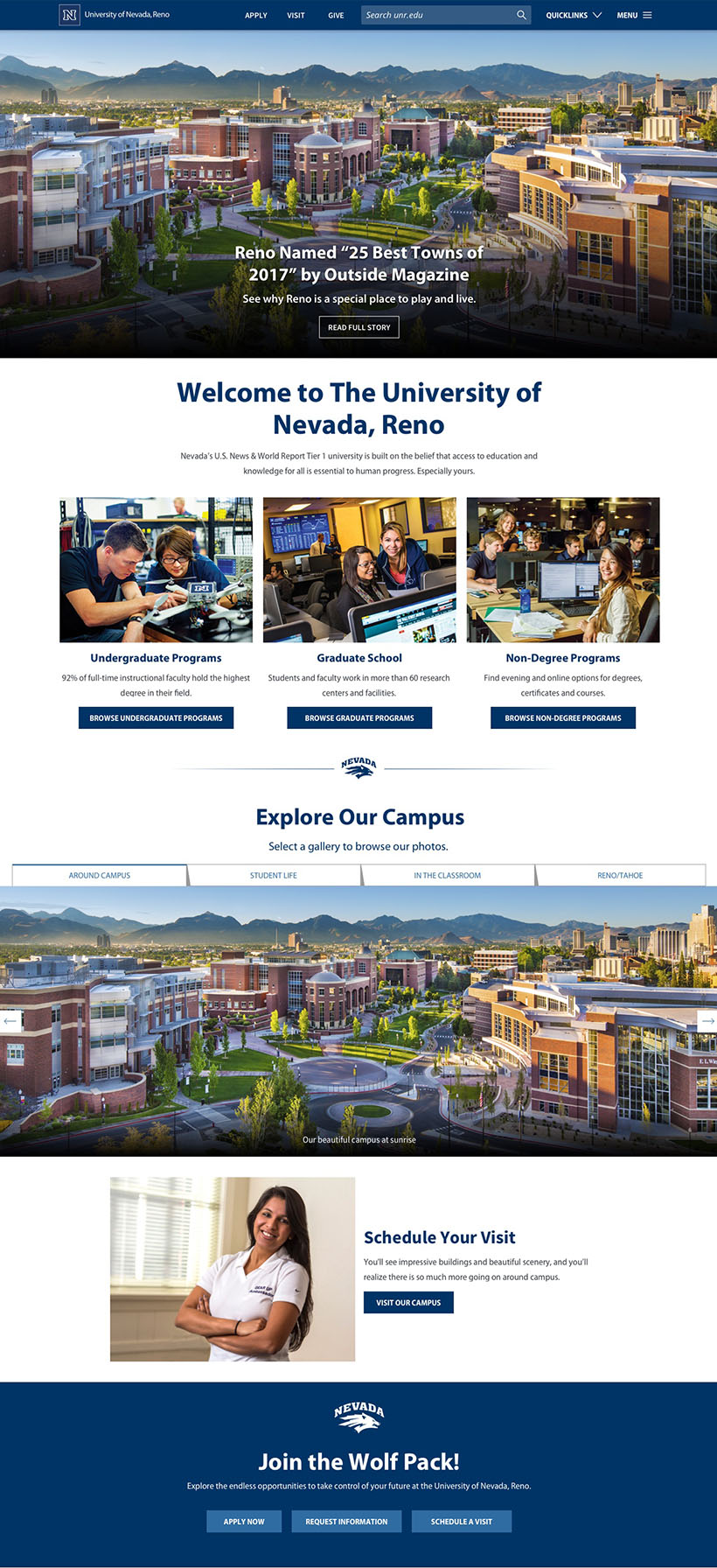
I translated the approved wireframes into visual designs in Sketch, incorporating university brand typography, color, and photography, then built an Invision prototype for administrative sign-off.
Challenges
Getting buy-in during the research phase was hard — much of the team wanted to jump straight to wireframes. Tying every subsequent design decision back to the research data is what got that trust, and it’s the same pattern I still rely on: lead with evidence when a decision is contested.
Learnings
- With a 5-person web team and no dedicated front-end developer, I picked up front-end work out of necessity, and it pushed me to think in systems rather than one-off pages.
- Nearly every department wanted primary-nav placement. Resolving that with analytics rather than negotiation was a formative lesson in how data can help persuade stakeholders — a principle that now sits at the center of how I approach optimization.